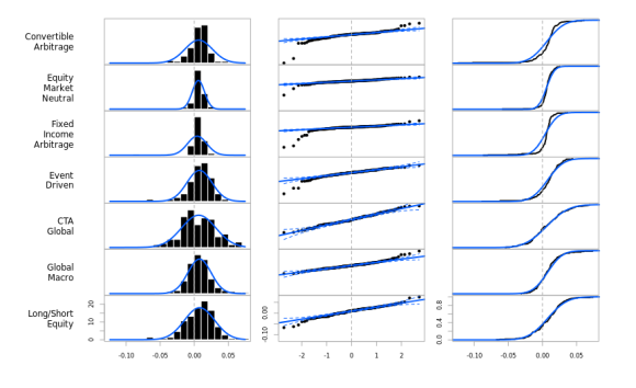
Here is a spot of code to create a series of small multiples for comparing return distributions. You may have spotted this in a presentation I posted about earlier, but I’ve been using it here and there and am finally satisfied that it is a generally useful view, so I functionalized it.
require(PerformanceAnalytics)
data(edhec)
page.Distributions(edhec[,c("Convertible Arbitrage", "Equity Market Neutral","Fixed Income Arbitrage", "Event Driven", "CTA Global", "Global Macro", "Long/Short Equity")])

When visually comparing distributions, there are a few characteristics to get right across the graphs. For example, each histogram’s bin sizes should match and the min and the max of each chart should line up.
I prefer all three views together. The histogram is a more typical view of the distribution, improved when overplotted with a normal distribution and with the zero bin marked, both being important references. The QQ plot is more important, again improved with confidence bands for a normal distribution.
This is just a first cut. There’s no reason that the normal distribution has to be the reference for these charts, but I’ll have to do some more parameterization. There is also a balance between the number of rows in the device and readability. Maybe I’ll insert some “pagination” like charts.BarVaR uses… What else?
This is checked into PApages on r-forge right now, in /sandbox as page.Distributions.R. I’m contemplating including it in PerformanceAnalytics, but I’m interested in your feedback before I do. Here’s the code:
# Histogram, QQPlot and ECDF plots aligned by scale for comparison
page.Distributions <- function (R, ...) {
  require(PerformanceAnalytics)
  op <- par(no.readonly = TRUE)
  # c(bottom, left, top, right)
  par(oma = c(5,0,2,1), mar=c(0,0,0,3))
  layout(matrix(1:(4*NCOL(R)), ncol=4, byrow=TRUE), widths=rep(c(.6,1,1,1),NCOL(R)))
  # layout.show(n=21)
  chart.mins=min(R, na.rm=TRUE)
  chart.maxs=max(R, na.rm=TRUE)
  row.names = sapply(colnames(R), function(x) paste(strwrap(x,10), collapse = "\n"), USE.NAMES=FALSE)
  for(i in 1:NCOL(R)){
    if(i==NCOL(R)){
      plot.new()
      text(x=1, y=0.5, adj=c(1,0.5), labels=row.names[i], cex=1.1)
      chart.Histogram(R[,i], main="", xlim=c(chart.mins, chart.maxs),
                      breaks=seq(round(chart.mins, digits=2)-0.01, round(chart.maxs, digits=2)+0.01, by=0.01),
                      show.outliers=TRUE, methods=c("add.normal"), colorset =
                        c("black", "#00008F", "#005AFF", "#23FFDC", "#ECFF13", "#FF4A00", "#800000"))
      abline(v=0, col="darkgray", lty=2)
      chart.QQPlot(R[,i], main="", pch=20, envelope=0.95, col=c(1,"#005AFF"), ylim=c(chart.mins, chart.maxs))
      abline(v=0, col="darkgray", lty=2)
      chart.ECDF(R[,i], main="", xlim=c(chart.mins, chart.maxs), lwd=2)
      abline(v=0, col="darkgray", lty=2)
    }
    else{
      plot.new()
      text(x=1, y=0.5, adj=c(1,0.5), labels=row.names[i], cex=1.1)
      chart.Histogram(R[,i], main="", xlim=c(chart.mins, chart.maxs),
                      breaks=seq(round(chart.mins, digits=2)-0.01, round(chart.maxs, digits=2)+0.01, by=0.01),
                      xaxis=FALSE, yaxis=FALSE, show.outliers=TRUE, methods=c("add.normal"), colorset =
                        c("black", "#00008F", "#005AFF", "#23FFDC", "#ECFF13", "#FF4A00", "#800000"))
      abline(v=0, col="darkgray", lty=2)
      chart.QQPlot(R[,i], main="", xaxis=FALSE, yaxis=FALSE, pch=20, envelope=0.95, col=c(1,"#005AFF"), ylim=c(chart.mins, chart.maxs))
      abline(v=0, col="darkgray", lty=2)
      chart.ECDF(R[,i], main="", xlim=c(chart.mins, chart.maxs), xaxis=FALSE, yaxis=FALSE, lwd=2)
      abline(v=0, col="darkgray", lty=2)
    }
  }
  par(op)
}
This is great – it should definitely included in PerformanceAnalytics (which is by the way surely one of the best R packages anyway!)
This is a very good use of the small multiples idea and I think keeping them together on the same display is sensible. I was wondering whether you would gain any benefit from an additional column with the original time series?
Am I the only one who get this error when I run the code (R-2.15.2)
Error in q.function(P, …) :
unused argument(s) (xaxis = FALSE, yaxis = FALSE, ylim = c(-0.1237, 0.0745))
I’d like to publicly thank Peter for his help. In case others encounter this problem, it turned out that I needed the development version of the PerformanceAnalytics package (1.0.5.2). My first attempt to install this from RForge failed with “not available for R-2.15.2” so I ended up cloning the svn repository and building from source. But the multiple panel plot capabilities are worth the effort.
How we can install development version of PerformanceAnalytics?
great work and very helpful. I thought it might be nice to also offer another view with distributions across multiple accounts per manager, so if we have 3 managers each with 100 accounts, we could compare the distributions across accounts instead of time. I’ll play with it and see if I can accomplish with minimal code change.
Thanks again for all the great work.